
The best way to sell your online course is with a marketing campaign and a strong landing page. Your online course landing page should include the right elements and follow your brand to optimize conversion rates. But, what makes up a good landing page?
Below are 6 examples of online course landing pages that you can learn from:
- ConvertKit
- DIY Video School
- You Story School
- AdEspresso University by Hootsuite
- PRISM
- Live Off Your Passion
We’ll go into depth with each one to discuss what’s done well and what could be improved. First, let’s discuss what a landing page is.
What is a Landing Page?
A landing page is a standalone web page associated with a marketing campaign that’s action-oriented. It’s a “landing page” because a visitor “lands” on the page by clicking on a link from a marketing email or advertisement. The landing page provides more information about the product or service and aims to convert the visitor into a lead or customer.
Not all landing pages look the same, but they all should include fundamental elements to make up the page. These elements include:
- A main headline and supporting headline
- A clear and unique selling proposition
- The benefits of what you’re offering
- Images or videos of your course
- Social proof
- Reinforcement statement
- Closing argument
- Call-to-action (CTA)
Using the elements from the list above will help you build a strong online course landing page that can help you convert leads into students. The order of these elements may vary, but the way we’ve listed them above is a good place to start.
To better understand these elements, let’s take a look at 6 examples of online course landing pages. We’ll break down the components on the page to look at what they’ve done well and what could be improved.
Featured Resource: Creator's Guide to Collecting & Sharing Testimonials
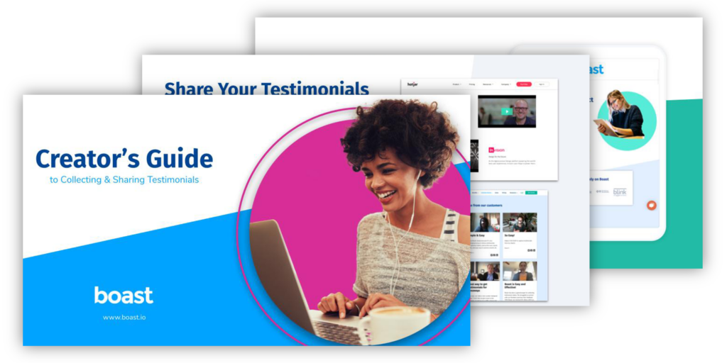
Download the Testimonial Guide for Creators!
6 Online Course Landing Page Examples to Learn From
1. ConvertKit

What they did well:
ConvertKit does a great job with their main and supporting headline to draw the visitor in and explain what the course can do for them. According to TechJury, 90% of visitors who read your headline will also read your CTA. It’s the first thing visitors see when landing on the page and has a large influence on whether they keep reading on.
The selling proposition is concise and clear. They include a short checklist to connect a problem the visitor may be facing along with how ConverKit can help. They follow this up with social proof from two course alumni who had a positive experience with the product.
Overall, the page is easy to navigate and has a clear CTA listed at the top and bottom of the page. Their closing argument is strong, showing how many creators they’ve helped over the last 6 years and entices the visitor to create a free account to build their business.
What could be improved:
The content of the course could be covered more in-depth. They explain there are two courses included with 4 modules and 20 lessons in each course. There is a quick bullet list of what the course is about, but it’s not enough. They may want to consider adding more detail here and include images or a video to show viewers an inside-look of the course.
While they did include social proof on their landing page, we only see two quotes, yet they’ve helped over 20,000 creators. To really show an impact, they could put together a video testimonial compilation of how their course has helped thousands of creators. Videos are powerful and when used on a landing page, it can improve conversions by 86%.
2. DIY Video School

What they did well:
DIY Video School does a good job of focusing on one CTA – to enroll in the course. They limit navigation to leave the landing page as a way to encourage visitors to read down the page.
They’ve incorporated a couple testimonials on the landing page as well. It includes a quote from a previous student, their image, job title, and a link to watch a full video testimonial. As we mentioned previously, video testimonials are powerful and can boost conversions.
What could be improved:
The overall design of the page could be improved. The top navigation bar blends in with the background at times and it is very text heavy. This can decrease readability on the landing page difficult and may deter visitors from staying on the page. They could try adding more images as visitors are 80% more likely to read content combined with pictures.
They may want to consider adding clear sections within the landing page. Where the sections begin and end is a little confusing and makes it difficult to scan the page. Most visitors won’t be reading the page word-for-word, so having defined sections with headings and subheadings will make it easier to navigate through the landing page.
At the top, they offer a link to watch a demo video which opens within the landing page (it’s important to keep them on the landing page). However, it may be beneficial to embed this on the landing page to increase views and promote the course.
3. Your Story School

What they did well:
This long-form landing page packs in a lot of content and information about the course in a strategic way. The main headline is unique and entices the visitor to read on. Much of this landing page is in a story format which suits the audience they’d be targeting.
The selling proposition is clear and stands out amid all the text. They’ve also done a great job explaining what’s inside the course and how it’s flexible across platforms. An overview is provided in the middle of the page and then it’s broken down into sections towards the bottom. This is a great strategy as the visitor may choose to continue scrolling past the CTA after the overview and later finds more information about what’s inside.
Testimonials are included throughout the landing page to provide social proof. There is also a section about the author of the course. This is a great idea to include for online course landing pages as it establishes credibility.
What could be improved:
Since this is a long-form landing page, navigation links at the top may be helpful. Some visitors may want to jump through the page to find specific information instead of reading all the way through.
They did include strong testimonials on the landing page, but to make it more impactful, they should turn them into video testimonials. Videos create a stronger emotional connection and emotions influence our buying decisions. Moreover, 66% of consumers state they’re more likely to make a purchase after seeing how the product or service impacted someone else.
Featured Resource: Creator's Guide to Collecting & Sharing Testimonials
Download the Testimonial Guide for Creators!
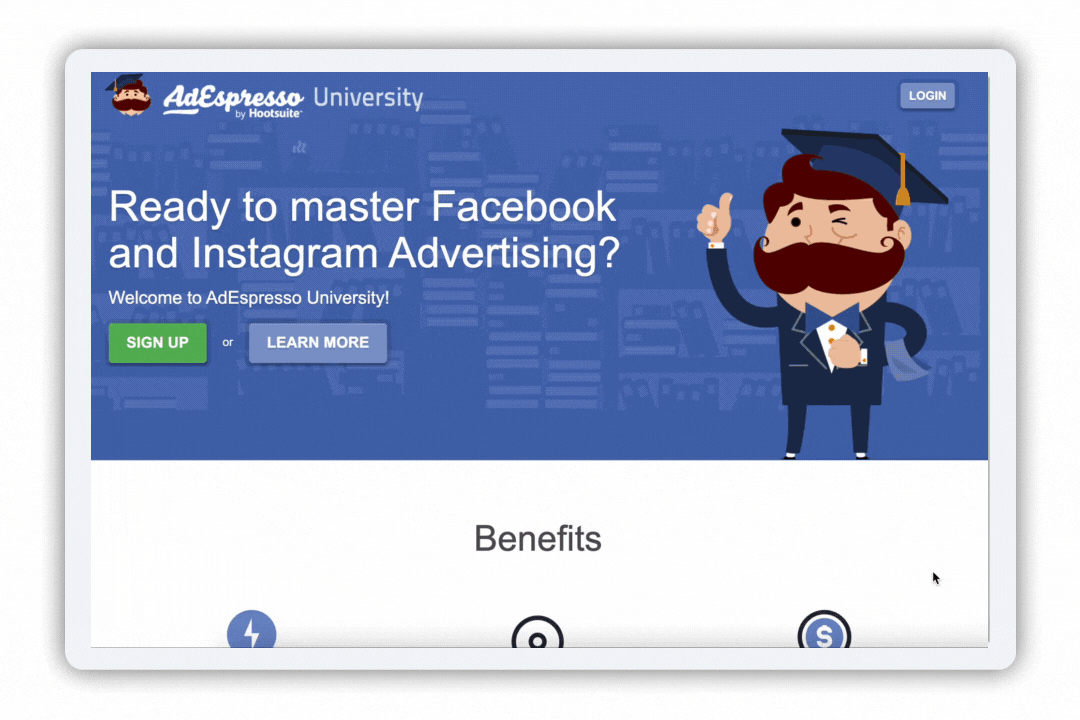
4. AdEspresso University by Hootsuite
What they did well:
The AdEspresso University landing page does a great job of incorporating headings to section out the page. This makes it much easier to scan the page for the information a visitor may want to read more of.
They’ve included course reviews near the top of the landing page and a few testimonials towards the bottom. The testimonials include a user-generated video of a student who had a positive experience with the course and a couple Facebook group stories. It’s a good strategy to provide social proof in a variety of formats.
The other element we want to point out is their on-page navigation. The landing page includes a lot of information about what’s included and how it works. They’ve added clickable icons in a horizontal line that allows the visitor the ability to jump to whatever content they want to learn more about.
What could be improved:
The main headline is not very unique, but does explain what the product will be about. The supporting headline could also use some improvement. Remember, these are the first words a visitor will read when landing on the page. It needs to be unique and entice the visitor to read on.
While the CTA buttons do stand out with their visual contrasting color, the text isn’t convincing. There is a lot of opportunity to vary the text throughout the landing page each time the CTA appears. Personalized CTAs convert 202% better than a normal CTA (e.g. “sign-up” or “submit”). Think about what information was just shared and what words may be used to entice the visitor to click the CTA.
5. PRISM

What they did well:
The overall aesthetic of this landing page plays well into the brand. It’s minimal, yet eye catching. There are no navigational links on top which keeps the visitor focused on the content in front of them and encourages them to scroll down. The main headline calls to the targeted audience and lets them know their course can help.
They’ve included a testimonial from a hiring manager who has hired candidates who’ve completed the PRISM course. This is an excellent use of testimonials as it brings in the perspective of how agencies view you after completing the course.
The landing page includes a breakdown of the course content in a simple overview at first along with the value/cost. If the visitor is still not convinced, they include a more in-depth look into the course content and what you’ll learn in each module.
What could be improved:
The quick course overview near the top of the landing page is helpful, but a link to jump to the full overview of the course may be helpful. The quick breakdown versus the full breakdown is a good strategy, but they should be internally linked for easy navigation on the page.
The video and information about the founder of PRISM could be moved up on the page. Sometimes this information is really important to a visitor to understand who created the course and what their credibility is.
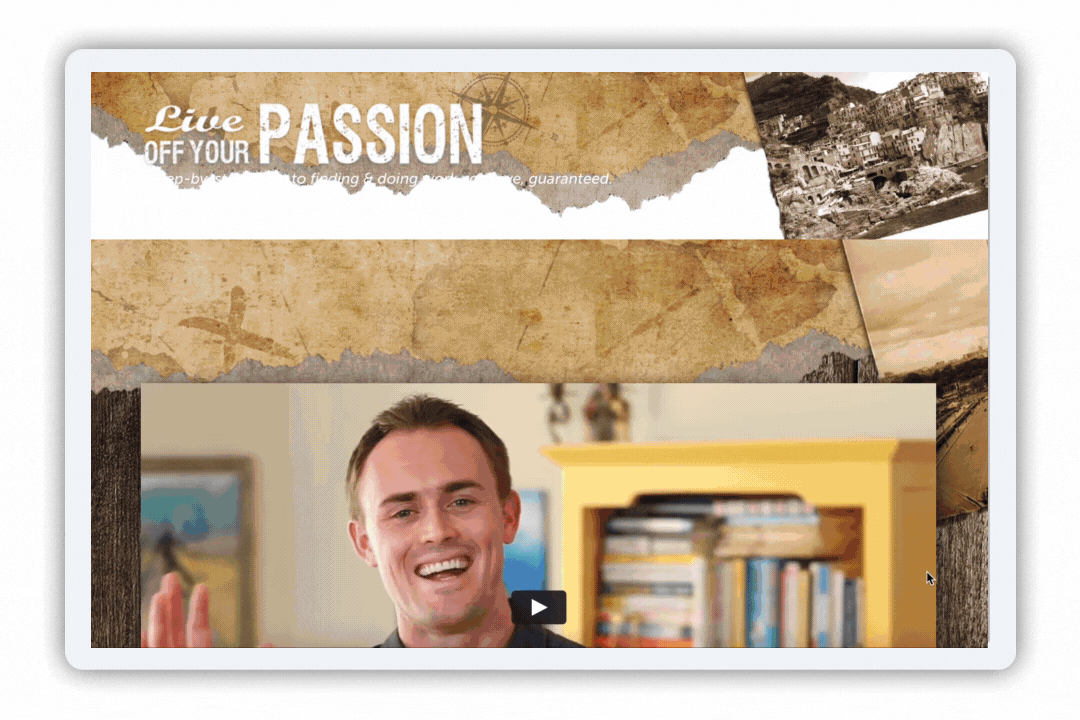
6. Live Off Your Passion
What they did well:
When you first land on the page, we find a video with the founder who explains why the course was created, the impact it can have and how it can help you. He highlights how his course is built on years of experience and his TED talk which has received over 2 million views. This shows the visitor the founder’s credibility and passion for this course.
The Live Off Your Passion landing page focuses largely on social proof. They have a “before and after” testimonial showing what a student was experiencing before taking the course and how they are thriving on their passion now. There are additional testimonials in text form throughout the landing page.
The CTAs are prominent throughout the page and always appear as an orange button, which contrasts well with the white background. They vary the text on each button depending on what it falls after within the landing page. This is a good strategy as you don’t want the CTA to be too redundant.
What could be improved:
The top of the page looks off as there is a header and then the video section. The ripped paper shows up twice with two images. This is not appealing to the eye when you first land on the page. The video is cut off (depending on the size of your screen), but it should be front and center as it’s the main content to draw visitors in.
It’s clear testimonials are important to the success of selling this course. As we mentioned, they’ve included multiple testimonials on this landing page. They may want to consider creating a compilation of video testimonials generated by the user. If this course is changing lives, the successful students are likely to display pure happiness which cannot easily be conveyed in text.
Featured Resource: Creator's Guide to Collecting & Sharing Testimonials
Download the Testimonial Guide for Creators!
These 6 online course landing page examples are only just a sample of what you can do. We hope you’re able to take the information above and apply it to your online course landing page. Remember to include the key elements and reduce navigation links that take the visitor away from your landing page. We also recommend conducting A/B testing as you build out your landing page. This will help you determine what elements work best and what might need to be changed.
Posted in: Social Proof